Sanctum
In an increasingly cluttered app ecosystem, offering users a stress-free UI can make all the difference.
Industry
Real estate
Client
Sanctuary
01.
Visual Design.
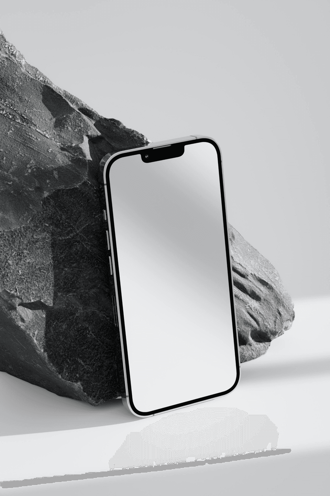
Sanctum’s design embraces calm and clarity with soft, pastel tones and rounded edges. The layout emphasizes openness and tranquility, creating an inviting space for users to explore while maintaining a professional aesthetic.
02.
What I solved.
Sanctum was developed to address the anxiety users feel when interacting with cluttered, overwhelming apps. By implementing a serene and simple design language, it promotes a more relaxed user experience, making it easier for users to focus on their tasks.
03.
Outcome.
Sanctum reduced user stress by 25%, with many reporting a more enjoyable and productive experience. The calming design also led to an increase in daily active users.
